
Branding for Contractors: Why Your Logo, Fonts, and Colors Matter (and How to Pick the Right Ones)
You build houses. Branding builds trust. When the right people see your trucks, website, or bids, they should think, “These are our people.” That snap judgment happens in seconds—before they read a word. Your logo, fonts, and colorsdo a lot of heavy lifting to attract the ideal customer and filter out the wrong ones.
Below is a simple guide to make your brand look intentional, professional, and aligned with the work you want next.
What “Branding” Really Means (Contractor Version)
Branding is the look and feel that shows how you work:
Logo = your mark/signature
Fonts = your voice (quiet, bold, technical, classic?)
Colors = the mood (serious, luxury, friendly, fast)
Photography = proof (clean jobsites, craftsmanship, scale)
Consistency = trust (same look everywhere)
If you keep these consistent on trucks, shirts, jobsite signs, proposals, website, Google listing, and social, you’ll look like a company worth hiring—and worth paying more.
Why It Matters (Even If You’re Booked Out)
Attracts better-fit projects. People judge if you’re “their people” at a glance.
Raises price tolerance. Professional design signals organized process and lower risk.
Speeds up hiring. Good tradespeople want to join reputable, put-together teams.
Saves time. Clear branding means fewer “are you the right contractor for…?” calls.
Start With Your Ideal Customer (It’s Not “Everyone”)
Ask three questions:
What jobs do you want more of? (e.g., steel TI work? whole-home custom builds?)
Who signs the check? (facility manager vs luxury homeowner)
What do they value most? (speed/safety/compliance vs craftsmanship/design/details)
Your answers shape your logo, fonts, and colors.
Commercial vs Custom Home: Two Different Brand Directions
Below are example brand shapes to show how your choices change by audience.
A) Commercial/Industrial General Contractor
Client: facility managers, developers, architects
Values: safety, speed, capacity, compliance, precision
Logo style: simple monogram or wordmark; geometric; scalable on hard hats and plan sets
Fonts: clean sans-serif (think “technical” and readable at distance): Inter, Roboto, Helvetica, Eurostile
Colors: bold, high-contrast, safety-aware
Primary: Deep Navy (#0A2342) or Charcoal (#2B2B2B)
Accent: Safety Orange (#FF7A00) or Construction Yellow (#F2C300)
Neutral: Concrete Gray (#D9DCDE)
Vibe: “We mobilize fast, document everything, and keep your site safe.”
B) Custom Home Builder / High-End Residential
Client: design-forward homeowners, interior designers, realtors
Values: craftsmanship, materials, details, service, longevity
Logo style: refined wordmark or monogram; subtle icon (gable, ridge, chisel)
Fonts: elegant serif + clean sans pairing (heritage + modern):
Serif (headlines): Playfair, Canela, Libre Baskerville
Sans (body): Source Sans, Lato, Avenir
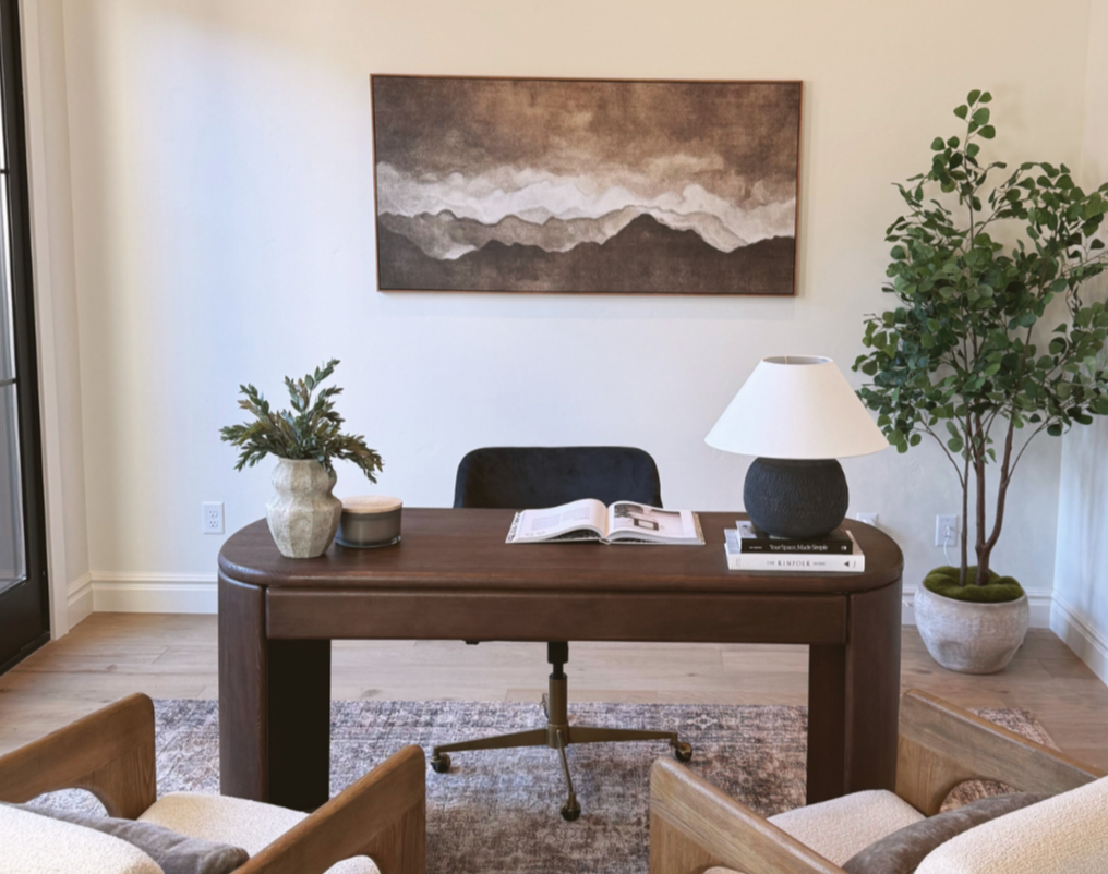
Colors: calm, timeless, premiumPrimary: Warm Black (#1C1B1A) or Deep Forest (#0E2A21)
Accent: Aged Brass (#B08D57) or Clay (#C96F53)
Neutral: Linen (#F2EFEA), Stone (#CAC5B9)
Vibe: “Quiet luxury, gallery-level finishes, white-glove communication.”
See the difference? Commercial says capacity + compliance. Custom home says craft + calm. Both can be true, but you should choose one lead story.
How to Choose a Logo (Fast Checklist)
Simple beats clever. If it’s unreadable on a tailgate at 40 mph, it’s not working.
One strong symbol or just a wordmark. Avoid tiny details.
Test at three sizes: hard hat sticker, truck door, website header.
Pick one version for light backgrounds and one for dark.
Avoid clip-art houses/roofs unless they’re very minimal and well executed.
Fonts: The Voice of Your Brand
Commercial GC: single, technical sans-serif (e.g., Inter). Use bold for headlines, regular for body.
Custom Home: pair a classy serif for headlines with a clean sans for body.
Rules: 2 fonts max; 3 sizes (H1, H2, body). Keep spacing generous and consistent.
What fonts say:
Sans-serif = modern, efficient, “we get it done”
Serif = heritage, craftsmanship, editorial, premium
Colors: Set the Mood in 3 Swatches
Pick 1 primary, 1 accent, 1 neutral. That’s enough.
Use contrast for readability (dark text on light backgrounds or vice versa).
Keep saturation under control for premium looks (especially residential).
Use your accent color for CTAs (buttons, phone number, “Get an Estimate”).
Consistency = Trust (Where to Apply Your Brand)
Vehicles & Trailers: large logo, URL, service line, phone.
Jobsite Signage: clean sign with logo, license, phone, QR to portfolio.
Crew Gear: matching tees/hoodies, high-viz vests with logo, branded hard hats.
Proposals & COs: your logo, colors, and typography on every document.
Website & Google Business Profile: same logo, fonts, colors, photo style.
Social & Project Photos: consistent filters/lighting; clean, protected jobsites.
If it leaves your shop, it should look like your brand.
Messaging That Matches the Look
Your words should match your visuals.
Commercial: “Safety-first. Transparent schedules. Night work available. Documentation your lender and architect love.”
Custom Home: “Quiet jobsite. Dust control daily. Marble-friendly handling. Weekly progress walkthroughs.”
Add one sentence that states your niche, location, and promise:
“Design-driven custom homes in Eagle & Boise. Built with museum-grade care.”
Before / After: A Quick Rebrand Example
Before (generic):
Red/black palette, stock roof icon, three different fonts
Facebook full of random progress shots, no context
Proposals in Times New Roman
After (custom home focus):
Wordmark + monogram, serif/sans pair, forest + brass + linen palette
Website shows before/after with 2-sentence stories and material call-outs
Proposals use the same fonts/colors with a simple cover page and process graphic
Result: Fewer small jobs, more design-focused inquiries, higher average project value.
7 Simple Steps to Build Your Brand (In a Weekend)
Pick your lane: commercial/industrial or custom residential (primary focus).
Choose a personality: (a) Efficient/Technical or (b) Craft/Luxury.
Select fonts: one sans for commercial; serif + sans for custom.
Choose colors: 1 primary + 1 accent + 1 neutral (grab the hex codes above if helpful).
Tighten your logo: clean wordmark or simple symbol; make a light and dark version.
Make a mini style guide (one page): logo uses, fonts, colors, examples.
Apply everywhere: trucks, proposals, website, GBP, social, jobsite signs, crew gear.
Hiring & Branding (Bonus)
Branding isn’t only for clients—it attracts talent:
Commercial: bold, high-visibility graphics signal steady work, safety culture, serious equipment.
Custom Home: refined look signals craftsmanship, better materials, slower pace, pride in detail.
When a great carpenter or superintendent checks your website and Instagram, they should think, “That’s the type of work I want to do.”
Common Mistakes (and Quick Fixes)
Too many colors & fonts. → Limit to 3 colors, 2 fonts.
Logo is tiny/complex. → Simplify and scale up on trucks and signs.
No contrast. → Dark text on light background (or reverse), especially on jobsite signs.
Inconsistent everywhere. → Make a one-page style guide and stick to it.
Photos look messy. → Sweep, cover, and light the area. Show protection and cleanliness.
Quick Brand Starter Kits (Copy/Paste)
Commercial GC kit:
Logo: bold wordmark
Font: Inter (Bold/Regular)
Colors: Navy #0A2342, Safety Orange #FF7A00, Concrete Gray #D9DCDE
Message line: “Safety-first builds. On schedule. Documented.”
Custom Home kit:
Logo: refined wordmark + small monogram
Fonts: Playfair (H1) + Lato (body)
Colors: Warm Black #1C1B1A, Brass #B08D57, Linen #F2EFEA
Message line: “Design-driven homes, built with museum-grade care.”
Final Word
Your brand is the silent foreman that speaks before you do. With a clear logo, the right fonts, and purposeful colors—applied consistently—you’ll attract the exact clients and crew you want. Pick a lane (commercial or custom), build a simple kit, and roll it out everywhere. You’ll look more professional tomorrow—and win better work next quarter.
Tired of losing jobs to competitors who “just look more legit” online?
We’ve got you. Our website templates are made to help you stand out, look professional, and start booking the clients you actually want.
You don’t need to be tech-savvy or super creative, just pick a template, plug in your content, and launch with confidence.